12/17/10

analogue throw away camera

So now that my beloved (see this post) Polaroid had shut down, and is really hard to get nowadays, I had to find a other (cheap) way to snap around-solution. Since I'm not a big fan of looking trough the screen when you should be looking through the lense, throw-away camera's appear to be the next hot item in my bag.

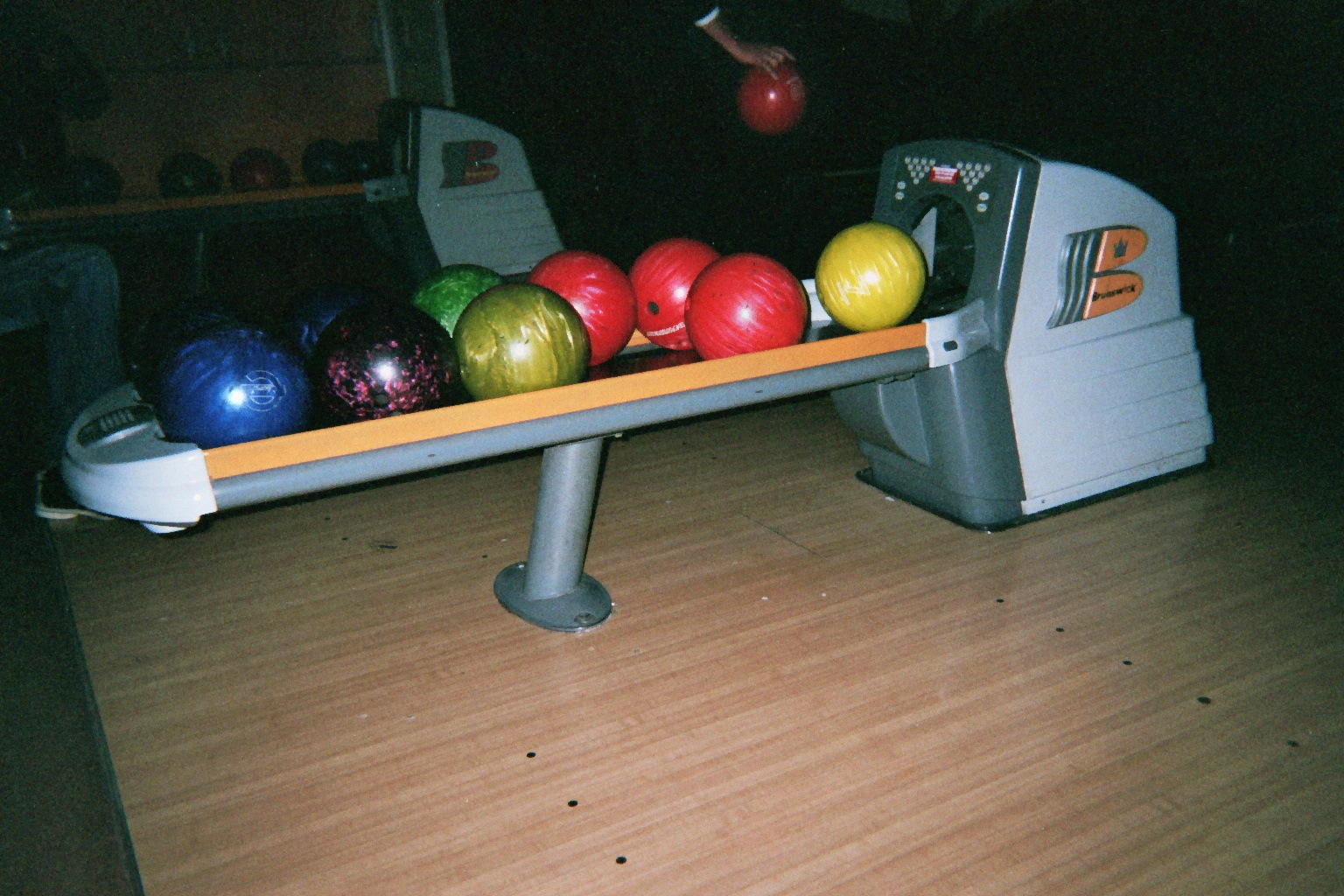
Here a few views from october/november 2010

vogue's cover graphics

Creative Review layered a bunch of covers of Vogue Magazine on top of the other. This to lay bare the structure of the formula of the cover's graphic design.
Actually, I like the layered ones so much better than the originals. They really look autonomous, outstanding and beautiful. It forces you to think on the way graphic design is used and put into practise.

The centered, white skinned, dark hared model:


I also remembered a artwork on vogue on the 'niet normaal' exhibition in Amsterdam.

Read the whole article on
http://www.creativereview.co.uk/cr-blog/2010/december/vogue-covers-2010

12/13/10

positive critique

Positief roddelen, de eigenheid in mensen zoeken, originaliteit bespeuren en kleine belachelijkheden uitvergroten (het gigantische bril-opzet effect) was wat wij urenlang deden vanaf het terras. Midden in de winter, midden in Amsterdam. Terwijl we zelf in een hele elendige, onbesluitbare, onorginele en brakke staat waren en we ons naar koffie en brood hadden gesleept. We waren oorspronkelijk bezig onze slechte gewoonten te legitimizeren. De zon was vandaag in de magna-plaza opgekomen, tenminste daar kwam het licht vanuit.